Following a two-month delay , Leap Motion is today finally launching its incredibly innovative 3D gesture controller to the public.

The first devices are being shipped to pre-order customers ahead of a retail release on July 27. For those lucky enough to get their controller today – a speedy or marginally early delivery is always possible – the company’s Airspace digital marketplace is also launching with roughly 75 apps.
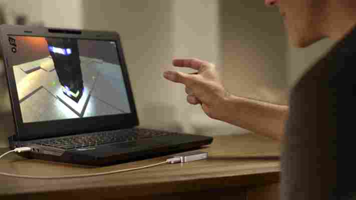
The potential of the Leap Motion Controller is almost unparalleled. The tiny piece of hardware is barely bigger than a lighter – it’s just three inches in length and 1.2 inches wide – but packs in three near-infrared LEDs and two CMOS image sensors to record and analyze the user’s hand movements.
The result is akin to the user interfaces found in popular sci-fi movies such as Minority Report and Iron Man 3. Any number of hand gestures, both subtle and broad, can be used to interact and control a normal piece of consumer hardware. This includes swiping up and down a Web page, drawing on-screen and using pinch-to-zoom to quickly navigate an overhead maps experience.
Leap Motion claims that the controller is 200 times more precise than Microsoft’s original Kinect peripheral, which was initially designed as a motion controller for the Xbox 360 but later became a popular choice with the Windows modding community.
The next version of Kinect , to be launched with the Xbox One and subsequently for PC users, is a huge improvement but will launch at least four months after the Leap Motion Controller – and with considerably more bulk. Leap Motion’s offering also supports Mac hardware however, which can’t be understated.
The controller will succeed based on its app selection, however. The hardware itself mimics the iPad, in that its potential needs to be realized by third-party developers – those who can integrate the gestures into existing or purpose-built software experiences. Seventy-five apps is a significant launch pad, but Leap Motion will need to expand the Airspace store further if its to continue to grow the controller’s userbase.
Pre-orders were originally set to ship on May 13 , following a retail launch in Best Buy stores across the United States on May 19. The delay announced in April was a considerable set-back, but let’s hope it was for a good reason – this could be next big development in the way users interact with technology.
Image Credit: Leap Motion
Toshiba puts the final nail in the netbook coffin, as it discontinues its range in the US
According to Liliputing , Toshiba is done with netbooks in the United States. The product variety, basement-priced micro-laptops that were exceptionally portable, sold millions of units, and helped certain brands grow in the public mind. However, the trend is over.

Yes, over. What happened? Netbooks were squeezed from two directions: functional tablets began to beat them out as knock-around devices for the house, and improvements in consumer laptop tech meant that their real purpose slowly ebbed away. Thus netbooks, an important, if brief moment in computing, have slowly come to an end.
Toshiba is hardly alone in its decision. A report on its decision on NeoWin makes the point:
Indeed. Interestingly, the report in Liliputing has an idea of where Toshiba is planning to deploy its resources, stating that ultrabooks will be its focus.
If you don’t know, an ultrabook is a netbook, but better, and more expensive. Ultrabooks are thin, and generally well-featured laptops that Intel has been pushing as a way to bring Windows-based computers to some sort of hardware parity with Apple’s popular consumer devices. They have been a sort of success, but Apple’s Macbook Air remains the clear segment leader.
Rest well netbooks, we won’t forget how bad your keyboards were, or how easily you slipped into a purse.
Why the iPhone should have a dedicated physical shutter button
There are two things that are completely clear at this point. First, Apple wants as few buttons as possible on the iPhone. Second, Apple is trying to position the iPhone as your primary point-and-shoot camera.

These two principles are working enough in counter-purpose now that one of them has to suffer. This is why Apple needs to add a dedicated physical shutter button to the next iPhone.
With the iPhone 4S, Apple introduced improvements to the camera that make it among the best available on any smartphone. A backlit CMOS sensor, a custom image processing chip and a huge increase in shutter release speed demonstrated a concerted effort on the company’s part to make this happen.
A large part of the iPhone 4S presentation was also given over to describing the camera and photography experience of the phone.
Smartphones continue to replace casual point-and-shoot compacts, proving the adage coined by photographer Chase Jarvis : The best camera is the one that’s with you. Apple knows this and wants to make sure that the absolute best photography experience on a smartphone happens on the iPhone. I think that they’re very close to this, despite a few missing features like white balance and burst mode (which are offered by third-party apps now and will likely come to Camera.app at some point).
But it is missing the boat by not having a dedicated button specifically for releasing the iPhone’s shutter.
In another life I sold digital cameras and gave classes about how to use them. One of the first things that I always sought to teach new owners of ‘sub-compact’ point-and-shoot cameras (the ones that are the size of a deck of cards, or smaller) was how to grip it properly to provide the most stable platform for shooting. It involved a pretty specific grip called ‘the crab claw’.
The crab claw was a grip that used two hands, one on either side of the camera, with the forefinger on the shutter button and both thumbs underneath the body. The middle fingers of each hand were used as support for the body, stabilizing and providing counter-pressure.
I obviously didn’t invent this grip, it actually happens almost naturally once you realize how many things you need to keep your finger off of on a tiny little camera. But some folks needed help to realize this, especially after cropping their finger out of 200 birthday pictures.
The crab claw was designed to do several things. It ensured that people kept a tight grip on these tiny cameras, allowing them to aim without fear of dropping. It kept fingers out-of-the-way of the lens, as well as the flash, which is normally positioned in an upper corner of the camera (opposite the shutter button). It also made it possible to press the shutter button without shaking the camera overmuch.
It’s not the only way to hold a point-and-shoot, but I found that it was the most reliable and use it myself to this day.
Before iOS 5, shooting a picture with the iPhone relied largely on the awkward ‘hold with two hands with the finger of one hand tapping the button to shoot’ method.
But now you can use the ‘volume up’ button to shoot images. It’s a physical button, right there on the side, and Apple didn’t have to add any extras! A great improvement, right?
Well, not so much. It turns out that repurposing the volume button has several major issues. This is what shooting a picture with the volume button looks like:
You’ll notice a couple of problems right off the bat. First of all, the lens and flash are in the completely wrong position, the lower right corner of the phone. This is a bad position as it puts the lens below ‘eye level’ when shooting an image. This means that the flash hits the face of a subject at a slightly up angle, a technique which produces a similar effect to the ‘flashlight under the face’ gag you use when telling spooky stories. It’s one of the cardinal ‘no no’s’ when lighting a subject.
Out beyond a couple of feet, it’s not as big of a deal, but as the flash normally only lights up the first couple of feet, that’s where you’ll be taking the majority of these images.
A side effect of the placement is that there is also a parallax -like effect at work here that makes it awkward to shoot macro images (using the fantastic Olloclip , for instance) while shoving the lower corner of the camera towards the subject.
Third, it’s pretty unstable. Just having your thumbs underneath gives the phone the ability to slip forward or backwards, flipping out of your hands and onto the pavement. The volume button (as it was not designed to be a shutter button) has a relatively stiff action, forcing you to press significantly harder than is wise with this grip. Not to mention the fact that your pinky finger often sits low enough to show up in the corner of the frame.
So, to improve the grip, you should really switch to ‘the crab claw’, this will improve the stability and comfort (it’s annoying having to hold those other fingers ‘up and away’) of shooting with a physical button. But here’s what happens when you try to use a comfortable grip:
The lens is obscured completely behind the supporting fingers. By repurposing the volume up button as a shutter, Apple has placed the lens in the worst possible place to execute a stable, comfortable grip. Instead, there needs to be a physical button (with the appropriate pressure sensitivity) placed on the opposite side of the phone below the SIM slot. This will allow you to comfortably grip the iPhone as you would any other point-and-shoot camera:
Other phone makers have already come to this conclusion. The Nokia Lumia 800, which I’m a big fan of , one-ups the iPhone in two ways by centering the camera so it is free of obscuring fingers and placing a shutter button on the lower right third of the device, allowing for a comfortable grip.
As an addendum:
If Apple were taking the position that ‘hey, there’s a camera on the iPhone, go ahead and use it if you want’, then this wouldn’t be such a big deal. But it’s not. It’s effectively positioning the iPhone as a replacement for any camera that doesn’t allow manual exposure. In other words, it wants it to be the camera that you grab when you take a quick shot of your family, your food, your vacation view.
If it wants to truly make the iPhone a useful and comfortable camera, as well as a phone, it needs to add a dedicated hardware shutter button, period.
There are other ways that it could fix the issue, like moving the camera to the center of the phone, but don’t expect that to happen. If there’s one thing that Jony Ive likes more than having as few buttons as possible, it’s putting logos in the center of Apple products.
